In the world of type design, "bold" is often mistaken for "loud." For years, Makro XM served designers who needed to scream. But as the landscape of branding and UI/UX shifted toward more nuanced, sophisticated systems, we realized that the original Makro needed more than just a facelift, it needed a skeletal reconstruction. The problem with many high-impact display faces is their lack of discipline. In our review of Makro XM, we identified a specific tension in the letterforms: the outward-leaning terminals created a "centrifugal" visual energy that, while striking in short headlines, lacked the stability required for cohesive brand ecosystems.
We didn’t just want to make Makro better; we wanted to make it more useful.
By returning to the foundations of the Modern Grotesk, the "workhorse" genre of typography, we’ve transformed Makro from a niche display face into a versatile variable typeface. We’ve replaced the outward terminals with inward-facing tips, introduced a double-storey ‘a’ and ‘@’, and engineered a 3-axis variable system. This isn't just a redesign; it’s an intentional move toward surgical precision for today’s digital-first designers.
The Ergonomics of the Terminal: Why "Inward" Matters
Typography is a game of invisible forces. In the previous iteration, Makro XM featured terminals that leaned outward, a design choice that provided kinetic energy but often compromised the "block" stability essential for high-end layouts.
When a terminal faces outward, it pushes the eye away from the character's core. In the redesign, we meticulously adjusted these tips to face inward. This subtle refinement does two critical things:
- Enhanced Visual Gravity: By pulling the terminals inward, the characters feel more "solid" and grounded. This is vital in the Black weights, where outward energy can make a headline feel "shattered" rather than cohesive.
- Improved Line Leading: Inward terminals create a cleaner vertical rhythm. This allows you to tighten the tracking and leading in headlines without the letterforms clashing or creating distracting tangles of negative space.

Modern Grotesk Roots: Stability Meets Sharpness
The new Makro is unapologetically rooted in Modern Grotesk principles. We’ve moved away from eccentric display traits to embrace the disciplined contrast found in classic engineering. This genre is defined by its geometric simplicity and authoritative tone, offering a more "human" feel than strictly geometric sans-serifs while maintaining industrial precision.
You’ll notice this most in the "tension points" of the letterforms. We’ve sharpened the transitions where the bowls of the b, d, p, and q meet the stems. Likewise, the shoulders of the h, n, and r have been refined to ensure that even at the Condensed width, the counters remain open and legible. This shift to a more traditional structure provides a reliable foundation that doesn't break under the pressure of complex UI environments.

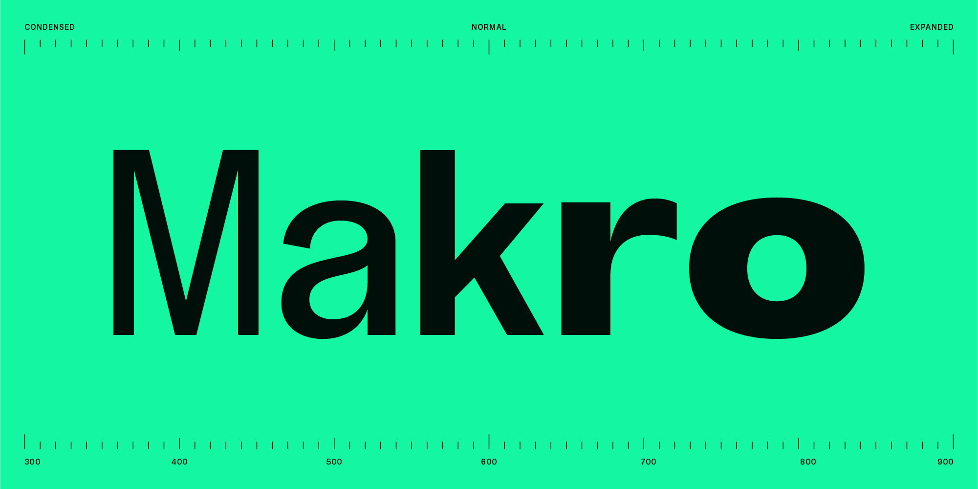
The Three Axes of Power: Total Variable Control
The centerpiece of the redesign is the transition to a 3-Axis Variable Font architecture. For the modern creative director, a static font family is a limitation; a variable font is a solution. This technology is particularly powerful for responsive web design, allowing the font to "flex" based on viewport width while reducing server requests to a single file.
The new Makro allows you to slide seamlessly across three dimensions:
- Weight (Light to Black): Seven core weights that maintain optical balance from delicate captions to soul-crushing headlines.
- Width (Condensed to Expanded): The transition from the tight, architectural feel of the Condensed axis to the cinematic sprawl of the Expanded axis happens without losing the typeface’s DNA.
- Slant (Italic): Matching italics across all widths ensure your emphasis stays stylistically consistent.

Distinctive Anatomy: The Double-Storey Evolution
While we embraced the Grotesk tradition, we didn't abandon the "Makro personality." We’ve introduced unique shapes that act as brand anchors:
- The Double-Storey ‘a’ and ‘@’: We’ve implemented a traditional double-storey lowercase ‘a’ for better legibility and a distinctive double-storey form for the ‘@’ symbol. Most '@' symbols use a single-loop design; our double-storey version brings a sophisticated, typographic "blink" to your contact sections and digital headers.
- The Reimagined Hash (#): Typically slanted, we reimagined the ‘#’ with a straight structure using parallel vertical and diagonal lines. This geometric precision ensures it aligns perfectly with the verticality of Modern Grotesk layouts.
With over 744 glyphs and enhanced OpenType features, Makro is engineered for both high-resolution print and retina screens, designed to elevate the technical standard of your work.


Conclusion: Unlock Your Creative Potential
The redesign of Makro marks a shift toward discipline and versatility. By embracing the Modern Grotesk tradition, refining the terminals and perfecting the variable 3-axis system, we’ve built a tool that doesn't just sit on a page; it commands it. From the surgical precision of the Condensed axis to the cinematic authority of the Expanded weights, Makro is the marriage of heritage and technology, a classic structure reimagined for the modern design landscape.
Don't just take our word for it, feel the axes for yourself.