Custom Fonts Projects - Tokotype
Jenius Think Unthinkable

Project Information

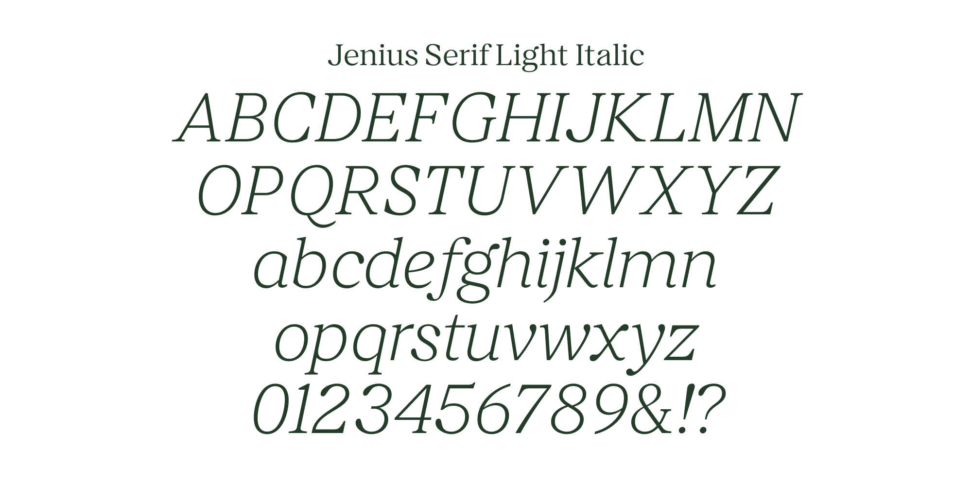
Jenius Serif is a modern classic serif font designed to complement its sans-serif counterpart, Jenius Sans. This elegant serif typeface was specifically created for the Jenius Think Unthinkable campaign, a collaborative projects between Jenius and Animal3 Agency with Tokotype as their main partner to create the custom fonts. Jenius Serif's soft edges provide a subtle contrast to the sharpness of Jenius Sans, creating a harmonious visual balance between the two fonts, the font's classic design is updated with modern elements, making it suitable for contemporary designs while maintaining a timeless appeal. The primary use of Jenius Serif in the Jenius Think Unthinkable campaign showcases its effectiveness in conveying a message while maintaining a sophisticated and professional appearance.

Additional Information

Project

Jenius Think Unthinkable

Agency

Animal3 Creative

Styles

1 Family - 8 Styles

Scope of Work

Custom Typefaces


Background


Jenius, Indonesia’s leading digital banking platform, launched the Think Unthinkable campaign as a bold invitation for users to challenge conventions and reimagine what banking could be. To support this campaign, Jenius collaborated with Animal3 Agency and Tokotype to develop a new custom typeface, Jenius Serif, designed to complement the existing Jenius Sans and expand the brand’s expressive range.


Brief


The project called for a modern classic serif that could balance sophistication with contemporary relevance. Jenius Serif needed to provide a visual contrast to the sharp, clean forms of Jenius Sans, while still feeling like a natural extension of the brand. The typeface had to embody the spirit of the Think Unthinkable campaign—forward-thinking, confident, and refined—while maintaining the clarity and functionality essential for digital and printed communication. It was important that the serif felt fresh and elegant without appearing old-fashioned or overly formal.


Delivery


Jenius Serif was designed as a modern interpretation of classic serif traditions, updated with subtle contemporary details to match today’s visual language. Its soft edges and carefully proportioned forms provide a warm counterpoint to the sharper, more geometric style of Jenius Sans, creating a harmonious relationship between the two typefaces when used together.


With a design that blends timeless elegance and modern sharpness, Jenius Serif allows the brand to deliver sophisticated messages without sacrificing approachability. Its use throughout the Think Unthinkable campaign demonstrated its versatility—strong enough for impactful headlines, refined enough for editorial content, and adaptable enough to carry the campaign’s core message across multiple platforms.


More than just a supporting asset, Jenius Serif plays an essential role in expanding the emotional and visual vocabulary of the Jenius brand, reinforcing its mission to think differently, act boldly, and lead with innovation.

Related Projects

XLSMART 1

XLSMART

BackgroundThe landscape of Indonesian telecommunications underwent a historic shift with the merger of two industry leading: XL Axiata and Smartfren. This was not merely a technical consolidation of networks; it was the birth of XLSMART, a brand designed to be a movement of synergy and empowerment.To anchor this new identity, XLSMART required a bespoke typographic system that could transition the brand from a traditional service provider to a human-centric leader in Indonesia’s digital era. The typeface needed to embody the brand’s core philosophy: Innovation with Heart.BriefThe primary challenge was to define a typographic voice for a telco brand that leads through empathy and collaboration. The brief called for a modern geometric sans serif that could reflect precision and empathy in equal measure. This typeface had to be built for absolute clarity across data-driven environments, balancing functional simplicity with a sense of subtle warmth. Strategically, the goal was to shift the narrative away from signal strength or speed toward a more human-centered vision of inclusion and progress. The resulting font needed to be versatile enough to empower a nation while remaining rooted in the technical excellence required for a modern digital infrastructure.DeliveryTokotype delivered XLSMART Sans, a modern geometric typeface family that serves as the visual cornerstone of the brand’s digital and physical presence. The design achieves a unique balance by utilizing open counters and rounded details to soften its geometric foundation, ensuring the brand feels accessible and collaborative. Its compact forms are optimized for high-density environments, providing maximum legibility across various platforms. This comprehensive collection offers extensive functionality and expressive power, allowing XLSMART to communicate with both authority and approachability as it leads Indonesia into a new era of digital innovation.

Traveloka 2

Traveloka

BackgroundAs a part of brand refreshment, Traveloka aimed to blend the inclusivity and distinctiveness in visual identity, yet aspirational but approachable, and a vibrancy of trust. To support this vision, the Godwit family was introduced as a custom geometric sans serif typeface—designed to reflect these values across all communication platforms. BriefThe goal was to design a versatile type family that could serve the wide-ranging needs of Traveloka’s brand—from bold headlines to detailed body text—while maintaining a consistent and recognizable character. Godwit needed to strike a delicate balance between modernity and warmth, offering a unique visual voice without sacrificing functionality or clarity. The design would need to extend across multiple sub-families, ensuring consistency in Latin and Thai scripts and across a variety of uses, from digital screens to out-of-home advertising.DeliveryGodwit Family was developed as a systematized, sophisticated type family built around key distinctive features. The exaggerated upper and lower proportions in certain letters, combined with unique cut-out tips in forms like 'W' and 'M,' give Godwit a memorable and energetic personality without overwhelming the reading experience. These subtle details were consistently applied across the family, ensuring a coherent visual tone at every touchpoint.The family is divided into three sub-categories: Godwit Display, Godwit Text, and Godwit Thai. Godwit Display retains the distinctiveness of the family and is optimized for large formats such as outdoor advertising, presentation decks, and headlines. Godwit Text adapts the same visual DNA but is fine-tuned for readability at smaller sizes, making it suitable for body copy, editorial content, and user interfaces. Expanding Traveloka’s linguistic capabilities, Godwit Thai was designed with direct reference to the Text sub-family, creating a seamless extension into Thai-script environments and reinforcing Traveloka’s presence across Southeast Asia.The result is a dynamic, biscriptual type system that supports Traveloka’s refreshed identity—making the brand feel more unified, accessible, and confidently modern across every communication channel.

Have a project for custom fonts in mind?

Tell us about your project. We’ll respond within 24 hours.