Custom Fonts Projects - Tokotype
Plus Jakarta

Project Information

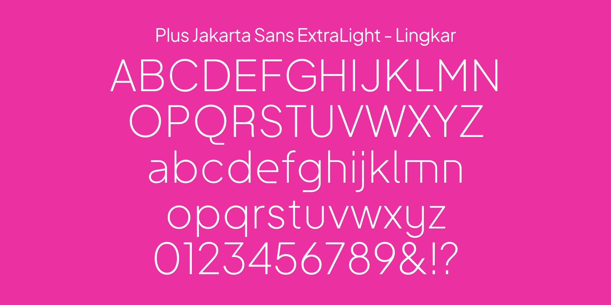
Plus Jakarta Sans is a fresh take on geometric sans serif styles, designed by Gumpita Rahayu from Tokotype. The fonts were originally commissioned by 6616 Studio for Jakarta Provincial Government program's +Jakarta City of Collaboration identity in 2020. Taking inspiration in Neuzeit Grotesk, Futura, and 1930s grotesque sans serifs with almost monolinear contrast and pointy curves, the fonts consist of modern and clean cut forms, the x-height dimension slightly taller to provide clear spaces between caps and x-height, and also equipped with open counters and balanced spaces to preserve the legibility at a large range of sizes. The beauty of diversity captured in typography. Like the city itself, the uniqueness of this font is that in some glyphs it has its own diversity and characteristic of various explorations of forms that enrich the expressions and stories that coexist. The charms of Plus Jakarta Sans fonts appear when one looks closer, manifesting in a beauty that emerges once seen as a whole. Each alternate in the family contains several alternative characters, divided into three stylistic sets which Lancip (Sharp), Lurus (Straight), and Lingkar (Swirl). As part of +Jakarta City of Collaboration, the fonts are made available for public use under the SIL Open Font License.

Additional Information

Project

Plus Jakarta

Agency

6616 Studio

Styles

1 Family - 12 Styles

Scope of Work

Custom Typefaces


Background


In 2020, the Jakarta Provincial Government launched the +Jakarta City of Collaboration program, aiming to redefine the city’s identity as a hub of creativity, diversity, and progress. As part of this initiative, 6616 Studio commissioned the creation of a custom typeface that could visually embody these values. Designed by Gumpita Rahayu from Tokotype, Plus Jakarta Sans was developed to serve as a versatile and contemporary voice for the city’s new era, capturing both its modern ambition and its rich cultural diversity.


Brief


The task was to create a geometric sans serif typeface that felt fresh, accessible, and expressive. Plus Jakarta Sans needed to function well across a wide range of applications, from government communications to public campaigns, while also being freely available to the public under an open license. Drawing inspiration from classic grotesque models like Neuzeit Grotesk, Futura, and 1930s-era sans serifs, the typeface would need to balance clean, modern construction with unique character details that reflected Jakarta’s multifaceted identity. Preserving legibility across all sizes, from small captions to large display uses, was critical to its success.


Delivery


Plus Jakarta Sans is a contemporary interpretation of geometric sans serif traditions, featuring almost monolinear stroke contrast and sharply defined curves. Its forms are modern and clean-cut, with a slightly taller x-height to create clear separation between capital and lowercase letters, enhancing readability across different scales. Open counters and well-balanced spacing ensure the typeface remains highly legible, whether used in print, on screens, or in public signage.


What sets Plus Jakarta Sans apart is how it embraces diversity through typographic form. Like the city it represents, the typeface offers unique characteristics within its glyphs, allowing for varied expressions without losing coherence. This richness is further amplified through three stylistic sets—Lancip (Sharp), Lurus (Straight), and Lingkar (Swirl)—which offer alternative letterforms to adapt tone and style depending on the context.


Available to the public under the SIL Open Font License, Plus Jakarta Sans is not just a typeface for government use; it is a gift to the city’s creative community, encouraging innovation and collaboration. Its strength lies not only in its clarity and functionality but in the subtle beauty that reveals itself over time, much like the vibrant, layered spirit of Jakarta itself.

Related Projects

Traveloka 1

Traveloka

BackgroundAs a part of brand refreshment, Traveloka aimed to blend the inclusivity and distinctiveness in visual identity, yet aspirational but approachable, and a vibrancy of trust. To support this vision, the Godwit family was introduced as a custom geometric sans serif typeface—designed to reflect these values across all communication platforms. BriefThe goal was to design a versatile type family that could serve the wide-ranging needs of Traveloka’s brand—from bold headlines to detailed body text—while maintaining a consistent and recognizable character. Godwit needed to strike a delicate balance between modernity and warmth, offering a unique visual voice without sacrificing functionality or clarity. The design would need to extend across multiple sub-families, ensuring consistency in Latin and Thai scripts and across a variety of uses, from digital screens to out-of-home advertising.DeliveryGodwit Family was developed as a systematized, sophisticated type family built around key distinctive features. The exaggerated upper and lower proportions in certain letters, combined with unique cut-out tips in forms like 'W' and 'M,' give Godwit a memorable and energetic personality without overwhelming the reading experience. These subtle details were consistently applied across the family, ensuring a coherent visual tone at every touchpoint.The family is divided into three sub-categories: Godwit Display, Godwit Text, and Godwit Thai. Godwit Display retains the distinctiveness of the family and is optimized for large formats such as outdoor advertising, presentation decks, and headlines. Godwit Text adapts the same visual DNA but is fine-tuned for readability at smaller sizes, making it suitable for body copy, editorial content, and user interfaces. Expanding Traveloka’s linguistic capabilities, Godwit Thai was designed with direct reference to the Text sub-family, creating a seamless extension into Thai-script environments and reinforcing Traveloka’s presence across Southeast Asia.The result is a dynamic, biscriptual type system that supports Traveloka’s refreshed identity—making the brand feel more unified, accessible, and confidently modern across every communication channel.

Gopay 2

Gopay

BackgroundAs one of Indonesia’s most widely used digital payment services, Gopay sought to evolve its visual identity to match its expanding role in everyday life. To achieve a deeper level of brand coherence and flexibility, Gopay introduced Rupa Sans and Rupa Serif, a pair of custom typefaces designed to bring a richer typographic voice to the brand’s communication. These typefaces were created to strengthen Gopay’s presence across digital, print, and environmental platforms, while staying true to the brand’s approachable and contemporary spirit.BriefThe task was to create a type system that offered both versatility and character. Gopay needed a sans-serif and a serif that could work individually or together, providing visual harmony across a broad range of applications. The design had to reflect a modern aesthetic while maintaining a human touch, connecting the brand to its audience with authenticity and warmth. The inspiration drew heavily from the twists and subtleties found in vernacular typographic traditions, aiming to create fonts that felt fresh and forward-looking without losing a sense of cultural continuity.DeliveryRupa Sans and Rupa Serif were developed as a sophisticated dual-font family, offering a complete typographic toolkit for Gopay’s growing ecosystem. Rupa Sans embodies a clean, modern structure with subtle details that reference traditional letterforms, ensuring it remains accessible and friendly. Rupa Serif, while more expressive, is crafted with the same underlying principles, blending classic serif influences with contemporary proportions to create a seamless pairing.The result is a system that allows Gopay to move fluidly between different tones of voice—from casual and direct to elegant and formal—without breaking visual consistency. The relationship between the two typefaces captures a unique balance: modern forms layered with nuanced echoes of the past. Across the Gopay design system, Rupa Sans and Rupa Serif work together to reinforce the brand’s identity as dynamic, trustworthy, and culturally grounded, ready to serve users at every level of interaction.

Have a project for custom fonts in mind?

Tell us about your project. We’ll respond within 24 hours.