
Project Information
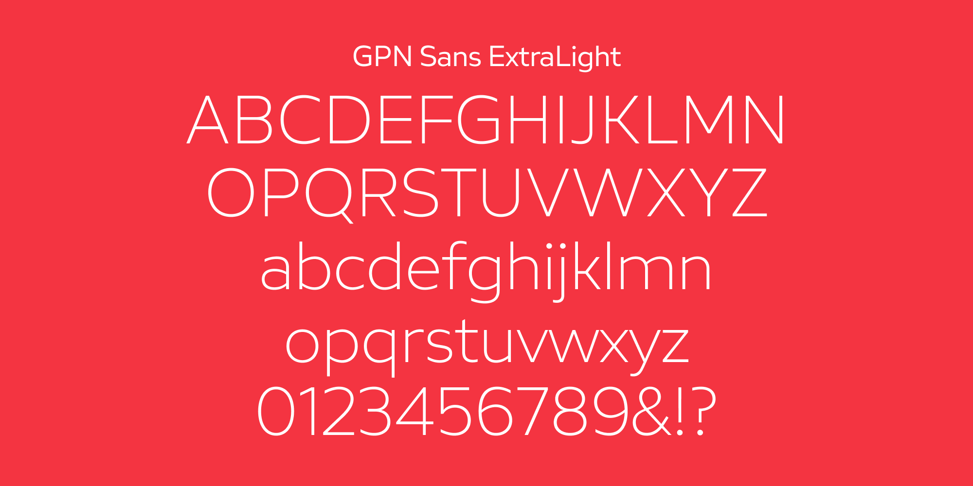
GPN Sans is a vibrant type family for Bank Indonesia’s brand GPN (Gerbang Pembayaran Nasional), with precise geometric construction of grotesque style and contemporary orientation. Designed with open lowercase shapes to leave the distraction on legibility, especially in small sizes, to provide clear information, sharp cuts on the edge are adapted based on the clean and fine cut on GPN wings, while its uppercase creates a strong and safe personality.
Additional Information
Project
GPN
Agency
Leo Burnett Indonesia & Visious Studio
Styles
1 Family - 12 Styles
Scope of Work
Custom Typefaces

Background
Gerbang Pembayaran Nasional (GPN) is Indonesia’s national payment gateway, developed by Bank Indonesia to unify and secure the country’s digital payment systems. As a crucial part of the country's financial infrastructure, GPN needed a visual identity that was both highly functional and instantly recognizable. To support this initiative, we were commissioned to create GPN Sans—a custom type family designed to embody security, clarity, and modernity across all public-facing and operational materials.

Brief
The goal was to create a typeface that would reflect the technological strength and trustworthiness of the GPN system, while remaining highly legible across a variety of formats and sizes. The typeface had to balance precision and accessibility, serving the needs of both digital interfaces and printed communications. Inspired by the clean geometry of grotesque styles, GPN Sans needed to offer a contemporary feel without losing the seriousness required by a national financial platform. Additionally, subtle visual references to GPN’s brand symbol, the wings, needed to be integrated into the design to strengthen brand cohesion.


Delivery
GPN Sans was developed as a precise, vibrant grotesque type family with a contemporary orientation. Its geometric construction ensures structural balance, while open forms on the lowercase letters maximize legibility, particularly at small sizes where clarity is essential. Sharp cuts along the edges of certain characters reference the clean, fine cut of the GPN wings, tying the typeface back to the core brand iconography without overwhelming the design.
The uppercase characters project a strong, safe, and institutional personality, reinforcing the platform’s role as a secure national service. Throughout the family, the visual tone is clear, stable, and confident—ideal for a system that millions of Indonesians depend on daily. GPN Sans now serves as a crucial part of GPN’s brand system, ensuring consistent, professional communication at every touchpoint, from cards and terminals to official documents and promotional materials.

Have a project for custom fonts in mind?
Tell us about your project. We’ll respond within 24 hours.