Aksen Font Family & Specimen - Tokotype

Aksen

Aksen

Aksen Styles

Uprights

Light

Regular

Medium

SemiBold

Bold

ExtraBold

Black

Aksen Styles

Italics

Light Italic

Italic

Medium Italic

SemiBold Italic

Bold Italic

ExtraBold Italic

Black Italic

Variable

400px

0px

1em

Highland

400px

0px

1em

Printable

400px

0px

1em

Reimpose

400px

0px

1em

Programs

48px

0px

1.2em

The tension between standardization and individual expression highlights one of linguistics' core debates: whether to regulate pronunciation or permit variation. Accent may carry social status connotations as a feature tied to geographical origin.

24px

0px

1.4em

Literature has long been a realm where the nuances of language are brought to life through careful attention to phonology, including stress and accent placement. This subtle yet crucial aspect of linguistic expression is often overlooked in discussions of written forms, but it plays a vital role in shaping the impact and resonance of a literary work. The history of literature is replete with examples of how the stress pattern of words has influenced their perception and usage. Consider, for instance, the way that classical Greek texts such as Homer's Iliad feature a distinct emphasis on certain syllables to convey drama and emphasis. Similarly, in later periods, the use of accent marks in languages like German and French allowed authors to fine-tune the way words were pronounced, adding an extra layer of expressive nuance to written language. In modern times, this focus on precise stress patterns continues to shape the world of literature. Designers and editors working on texts that are translated into multiple languages must carefully calibrate accent marks and emphasis signs to ensure that the intended rhythm and cadence of a work is preserved across different linguistic traditions. Moreover, advances in digital typography have made it possible for readers to experience a wider range of typographic settings, from bold sans-serif fonts used in e-book adaptations of novels to more nuanced, contextualized display of complex linguistic stress patterns in printed works. The development of new technologies has also expanded the possibilities for creative experimentation with language and phonology.

16px

0px

1.4em

Accents in literature are not merely a form of punctuation; they are an essential aspect of storytelling, weaving together the complexities of language and culture. From the subtle nuance of accent marks on German umlauts to the flamboyant flourishes of French trema, typography plays a significant role in conveying regional dialects and ethnic diversity. In the history of printing, accents have presented unique challenges for typesetters and font designers. For instance, the development of italic typefaces during the Renaissance required innovative ways to represent subtle cursive flourishes that often involved accent characters. Moreover, as languages evolved over time, new accented forms emerged to accommodate changing pronunciation patterns and cultural exchange. Typography has had to adapt to these changes, reflecting the ever-changing tapestry of human communication. Today, with digital technologies such as OpenType fonts and Unicode character encoding, the typesetting process for accents has become increasingly streamlined. Many contemporary typefaces incorporate comprehensive accent systems, allowing designers to render even the most obscure dialects with precision. This is a testament to the symbiotic relationship between typography and literature, where the meticulous reproduction of text mirrors the rich linguistic diversity that underlies it. Yet beyond mere technical proficiency lies an important creative opportunity: by embracing accents as an integral part of typographic design, we can further enrich our understanding of human language and its endless manifestations. The art of literature is deeply intertwined with typography, shaping the way we experience and interact with written works. In this domain, accents play a crucial role in distinguishing between languages, capturing nuances of cultural expression, and enriching the page. From medieval scribes' labored strokes to digital fonts' precision-cutting, typography has always been an integral component of literature. Accents – those subtle marks that ride just above or below letters – are an indispensable aspect of this symbiosis. Consider the French "é" and German "ü," which not only indicate specific phonetic realizations but also signal the cultural language into which the reader is being invited. In today's digital landscape, fonts like Google Noto and OpenType-enabled fonts have made it easier to access a wide variety of accents. Yet even as technology advances, there remains an aesthetic appeal to printed materials that emphasize typography by hand – consider manuscripts from monasteries in southern France or Japanese books adorned with handmade kanji script. These visual representations not only honor the craftspeople whose expertise shapes them but also speak to a tradition of care and attention inherent in literary creations passed down through generations of readers.
Solid Outline
Glyph Name
Character Name
Unicode Decimal
Unicode Hex

About Font

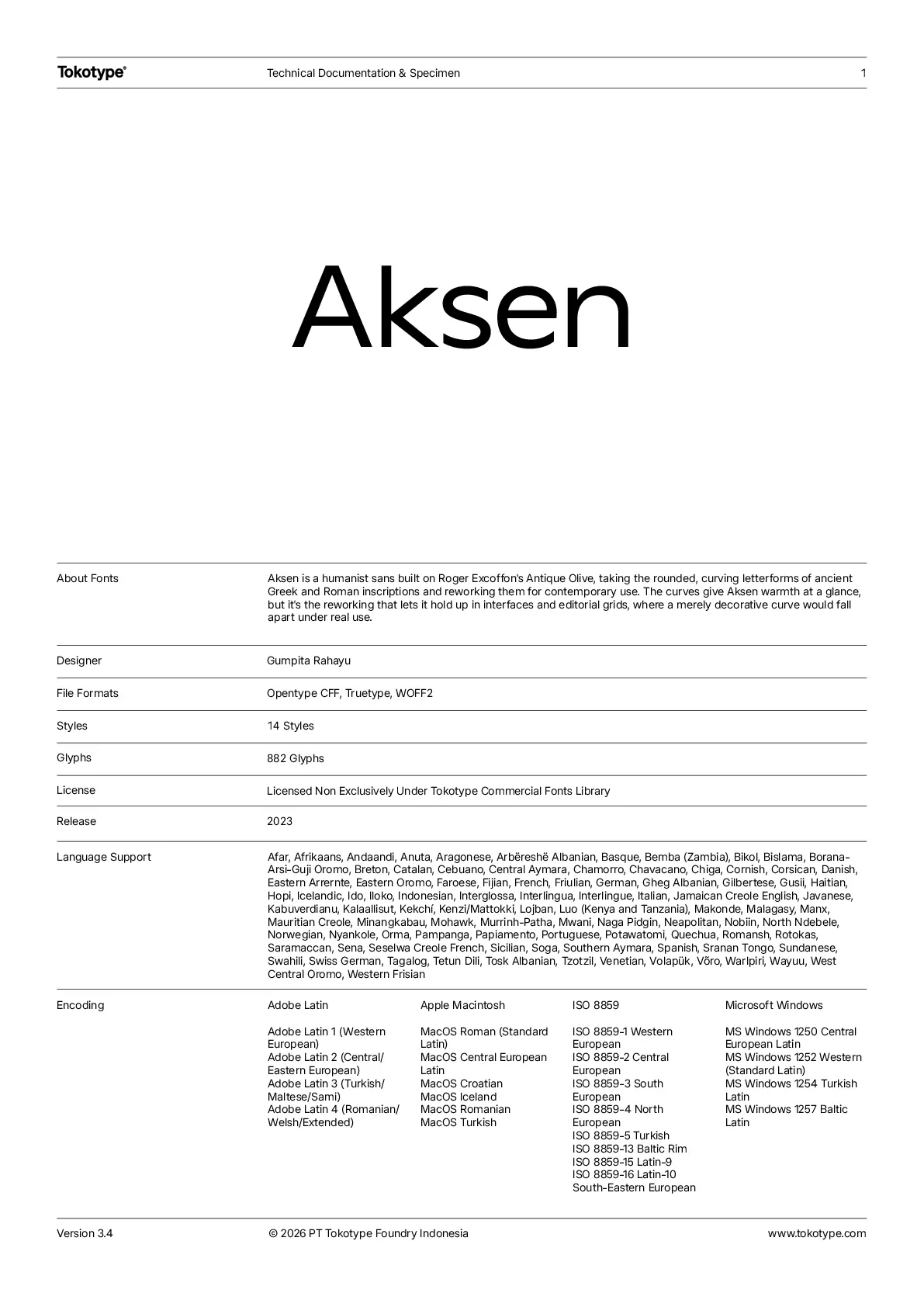
Aksen is a humanist sans-serif typeface inspired by Roger Excoffon’s Antique Olive. Its design echoes the rounded, curving letterforms found in ancient Greek and Roman inscriptions, reinterpreted with a contemporary, pragmatic approach. Available in 42 styles, Aksen spans three widths and seven weights, each accompanied by a matching italic. It is also offered as a variable font, featuring three axes—width, weight, and italic—providing designers with a high degree of flexibility. This adaptability allows Aksen to shift effortlessly between compact and expansive, light and bold, upright and slanted, making it suitable for diverse design applications. Blending contemporary humanist aesthetics with historical elegance, Aksen is a versatile choice for branding, editorial work, and digital interfaces, where warmth and functionality go hand in hand.

Font Information

Collections

14 Styles – Variable

Version

3.4

File Format

OTF, TTF, WOFF2

Designers

Gumpita Rahayu

PDF Specimen

PDF Specimen

Language Supports

Afar
Afrikaans
Andaandi
Dongolawi
Anuta
Aragonese
Arbëreshë Albanian
Asturian
Atayal
Basque
Bemba (Zambia)
Bikol
Bislama
Borana-Arsi-Guji Oromo
Bosnian
Breton
Catalan
Cebuano
Central Aymara
Central Nahuatl
Chamorro
Chavacano
Chiga
Cook Islands Māori
Cornish
Corsican
Creek
Czech
Danish
Eastern Arrernte
Eastern Oromo
Faroese
Fijian
French
Friulian
Ganda
German
Gheg Albanian
Gilbertese
Gusii
Gwichʼin
Haitian
Hopi
Hungarian
Hän
Icelandic
Igbo
Iloko
Indonesian
Italian
Jamaican Creole English
Javanese
Jola-Fonyi
Kabuverdianu
Kaingang
Kala Lagaw Ya
Kalaallisut
Kekchí
Kenzi
Mattokki
Kirmanjki
Latgalian
Lower Sorbian
Luo (Kenya and Tanzania)
Makonde
Malagasy
Maltese
Manx
Maori
Mauritian Creole
Minangkabau
Mohawk
Montenegrin
Murrinh-Patha
Mwani
Naga Pidgin
Neapolitan
Nobiin
North Ndebele
Northern Sami
Norwegian
Nyankole
Orma
Pampanga
Papiamento
Polish
Portuguese
Potawatomi
Quechua
Romanian
Romansh
Rotokas
Samoan
Saramaccan
Sena
Seselwa Creole French
Sicilian
Slovak
Slovenian
Soga
Southern Aymara
Southern Sotho
Spanish
Sranan Tongo
Sundanese
Swahili
Swiss German
Tagalog
Tetun Dili
Tokelau
Tonga (Tonga Islands)
Tosk Albanian
Tuvalu
Tzotzil
Upper Sorbian
Venetian
Vietnamese
Võro
Walser
Warlpiri
Wayuu
West Central Oromo
Western Frisian
Yoruba
Zapotec

Related Family

Aksen Condensed

Learn More

14 Styles – Variable

Aksen Expanded

Learn More

14 Styles – Variable

Download Trial Fonts for Free

Take our fonts for a spin! Enter your name, email address, and the font of your choice. Then, you can download it directly and start testing it for your project.