
Background
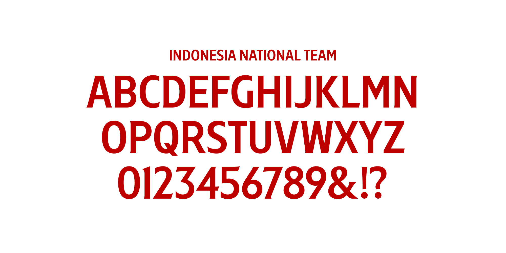
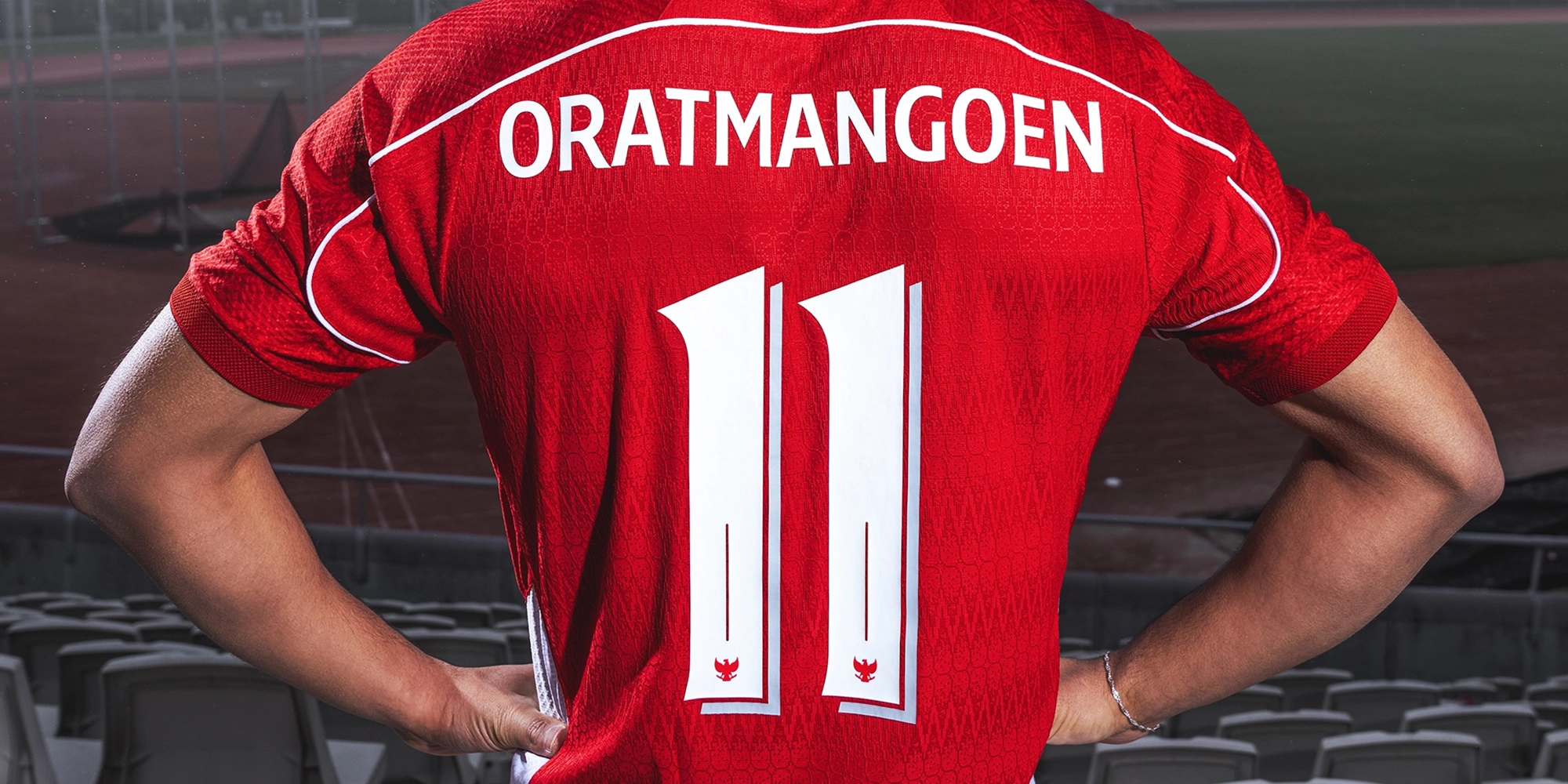
The Indonesian national football team has just released its latest home and away jerseys. Bringing together themes of diversity, the spirit of unity, and cultural richness, these jerseys are presented with immense pride and a strong sense of national character through traditional Nusantara visual elements. To complement these new jerseys, we designed a custom font for the nameset, which will be worn by the Garuda players on the pitch.

Brief
Our task was to create a font suitable and well-matched with the latest jerseys. As such, the patterns and motifs full of local elements on the jerseys played a central role and were given special attention during the design process. Our objective in this project was to design a modern and fresh nameset without losing traditional values.

Delivery
We began the visual development process by conducting research to study designs of namesets used by the Indonesian national team over the years—ranging from the default templates provided by apparel brands to custom namesets in more recent editions of the national team’s jerseys. One of our key findings from this research was the frequent use of varsity fonts, which are bold and characterised by angular, sharp edges.
Building on this insight, instead of continuing this trend, we explored creating an asymmetrical flare serif font. This approach allowed us to merge the characteristics of serif and sans-serif typefaces. Flare serif fonts are distinguished by their “flare” or the gradual widening at the ends of strokes. This design creates a smooth transition between “full” serif and sans-serif font shapes.
Through this creative approach, we aimed to deliver a simple design without entirely abandoning traditional typography. We believe the resulting font design, with its versatile and sharp-angled details, serves as the best duo to the strong traditional motifs and patterns on both home and away jerseys.