Custom Fonts Projects - Tokotype
Bank BCA

Project Information

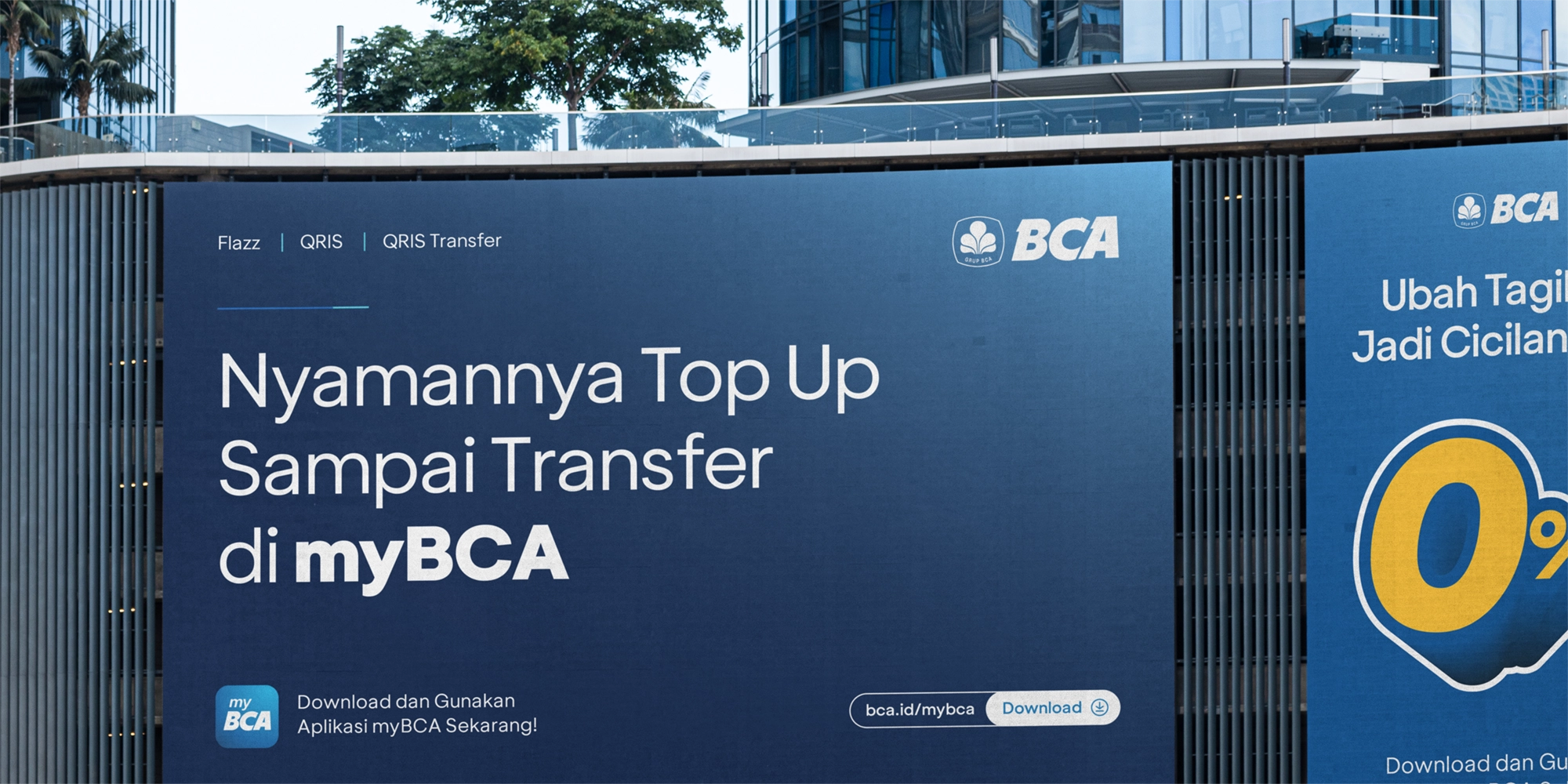
Commissioned by BCA's internal team, Tokotype crafted a custom typeface for Bank BCA, the largest private bank in Indonesia. The font family is crafted by combining a geometric approach with a modern sensibility. Designed to align seamlessly with Bank BCA's digital ecosystem, it enhances communication while reflecting the brand's progressive identity. Inspired by clarity and functionality, BCA Sans ensures a cohesive visual experience across platforms like myBCA apps and internal social media. BCA Sans not only supports Bank BCA's visual strategy but also reinforces its mission of innovation and clarity in the financial landscape as part of its design system.

Additional Information

Project

Bank BCA

Agency

Internal Team

Styles

1 Family - 10 Styles

Scope of Work

Custom Typefaces


Background


Bank BCA, Indonesia’s largest private bank, continues to expand its digital presence as part of a long-term vision of innovation and customer-centric service. To support this evolution, BCA’s internal team commissioned Tokotype to create a custom typeface that would unify the bank’s communication and enhance its growing digital ecosystem. BCA Sans was developed to be a modern, clear, and flexible visual foundation for the brand as it moves deeper into the digital financial landscape.


Brief


The challenge was to design a typeface that reflected Bank BCA’s progressive identity while maintaining a strong sense of reliability and trust. BCA Sans needed to seamlessly integrate into the bank’s various platforms, including the myBCA mobile apps, internal communications, and social media channels. The typeface had to project clarity, approachability, and a forward-looking attitude without straying from the seriousness expected from a leading financial institution. It was crucial that the typeface not only supported BCA’s evolving visual strategy but also strengthened its communication with users across every digital and physical touchpoint.


Delivery


BCA Sans was crafted by combining a geometric approach with a modern sensibility, resulting in a typeface that feels both precise and accessible. Its clean structure and balanced proportions were designed to ensure readability across screen sizes and resolutions, providing a cohesive visual experience from mobile applications to broader brand communications.


The inspiration behind BCA Sans centered around clarity and functionality, translating into forms that are sharp yet friendly, disciplined yet flexible. By building a unified typographic voice, BCA Sans reinforces the bank’s mission of innovation, reliability, and customer-first service. It stands as an essential part of Bank BCA’s design system, supporting its commitment to delivering clear, consistent, and forward-thinking experiences across Indonesia’s financial landscape.


Related Projects

XLSMART 1

XLSMART

BackgroundThe landscape of Indonesian telecommunications underwent a historic shift with the merger of two industry leading: XL Axiata and Smartfren. This was not merely a technical consolidation of networks; it was the birth of XLSMART, a brand designed to be a movement of synergy and empowerment.To anchor this new identity, XLSMART required a bespoke typographic system that could transition the brand from a traditional service provider to a human-centric leader in Indonesia’s digital era. The typeface needed to embody the brand’s core philosophy: Innovation with Heart.BriefThe primary challenge was to define a typographic voice for a telco brand that leads through empathy and collaboration. The brief called for a modern geometric sans serif that could reflect precision and empathy in equal measure. This typeface had to be built for absolute clarity across data-driven environments, balancing functional simplicity with a sense of subtle warmth. Strategically, the goal was to shift the narrative away from signal strength or speed toward a more human-centered vision of inclusion and progress. The resulting font needed to be versatile enough to empower a nation while remaining rooted in the technical excellence required for a modern digital infrastructure.DeliveryTokotype delivered XLSMART Sans, a modern geometric typeface family that serves as the visual cornerstone of the brand’s digital and physical presence. The design achieves a unique balance by utilizing open counters and rounded details to soften its geometric foundation, ensuring the brand feels accessible and collaborative. Its compact forms are optimized for high-density environments, providing maximum legibility across various platforms. This comprehensive collection offers extensive functionality and expressive power, allowing XLSMART to communicate with both authority and approachability as it leads Indonesia into a new era of digital innovation.

Traveloka 2

Traveloka

BackgroundAs a part of brand refreshment, Traveloka aimed to blend the inclusivity and distinctiveness in visual identity, yet aspirational but approachable, and a vibrancy of trust. To support this vision, the Godwit family was introduced as a custom geometric sans serif typeface—designed to reflect these values across all communication platforms. BriefThe goal was to design a versatile type family that could serve the wide-ranging needs of Traveloka’s brand—from bold headlines to detailed body text—while maintaining a consistent and recognizable character. Godwit needed to strike a delicate balance between modernity and warmth, offering a unique visual voice without sacrificing functionality or clarity. The design would need to extend across multiple sub-families, ensuring consistency in Latin and Thai scripts and across a variety of uses, from digital screens to out-of-home advertising.DeliveryGodwit Family was developed as a systematized, sophisticated type family built around key distinctive features. The exaggerated upper and lower proportions in certain letters, combined with unique cut-out tips in forms like 'W' and 'M,' give Godwit a memorable and energetic personality without overwhelming the reading experience. These subtle details were consistently applied across the family, ensuring a coherent visual tone at every touchpoint.The family is divided into three sub-categories: Godwit Display, Godwit Text, and Godwit Thai. Godwit Display retains the distinctiveness of the family and is optimized for large formats such as outdoor advertising, presentation decks, and headlines. Godwit Text adapts the same visual DNA but is fine-tuned for readability at smaller sizes, making it suitable for body copy, editorial content, and user interfaces. Expanding Traveloka’s linguistic capabilities, Godwit Thai was designed with direct reference to the Text sub-family, creating a seamless extension into Thai-script environments and reinforcing Traveloka’s presence across Southeast Asia.The result is a dynamic, biscriptual type system that supports Traveloka’s refreshed identity—making the brand feel more unified, accessible, and confidently modern across every communication channel.

Have a project for custom fonts in mind?

Tell us about your project. We’ll respond within 24 hours.