Jenius Sans is a compact companion of Jenius, an online banking platform from Bank BTPN. Jenius sans represents the continuity, flexibility, and possibilities of the brand to work with its visual system.
In 2016, Bank BTPN got in touch with Leo Burnett Indonesia to create a branding for Bank BTPN new platform for a revolutionary digital banking in Indonesia, Jenius. The agency was team up with Visious Studio who worked on the developing brand identity, brand guidelines, and production. The custom typeface was licensed exclusively for Jenius by Tokotype, and the Illustration assets by Spencer Wilson (London).
The main brief was to design a fairly specific brand that tells stories about how we manage our finances with more personal, confident, and authentic way for a simpler life and smarter finance. We convinced by the main ideas of how the banking brand will communicate with their audience, the answer is; they will not use a single photo to communicate as the content with their audience, because that’s a common thing for Indonesian banking platform, but if we put forward the design and typography, the brand will tell its story to reflect the natural tone of voice of how they will communicate for today’s trends.

Jenius language is always informal, engaging and precise, just like the brand personality of is brought, the tone of voice carried to guide the way the brands behave to engage with their audience, and as a creative solution, the brands need to communicate clearly for a specific audience to build a harmonious relationship equipped with a distinctive visual concept.
Therefore, it’s not only a conceptual approach to create Jenius branding, the specific need for typography was needed to complete the visual identity system, here is our role Tokotype is relied upon to designed Jenius Sans, a friendly companion of Jenius brand and it comes with three styles. With the direction of the Leo Burnett Indonesia and Visious Studio for over several months, the concept of the custom typeface is not far away from the existing Jenius mark, with a dynamic shape of a soft rounded corner touch and following rounded Mobius look alike but still consisted based on geometric structure to keep this typeface remains harmonized to blend in the design contents.

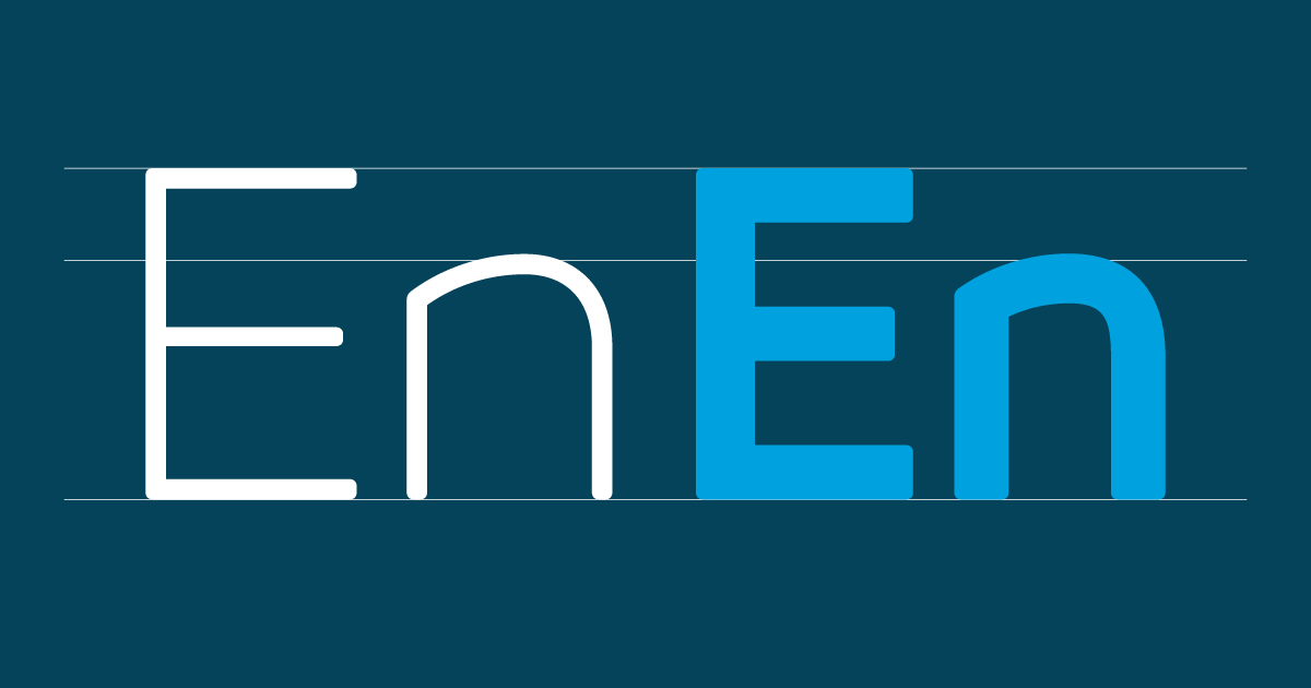
The structure of the typeface adjusted with relations each character that meet each other. The high x-height was enough to make this typeface can clearly see when they meet with a slightly wider and solid uppercase. The proportions of lowercase of this typeface also adapted to look balanced and compact when filling the contents space.
Another distinction of this typeface features is the construction of a “spurless” character in the other term; type designs that have no spurs, with curves seamlessly transitioning into straight stems, making it looks sharper, concise and fresh with the aesthetic capability can be clearly seen. That concept allows more textual information for headlines and creates a balanced tone when meeting other elements such as illustrations with different information.


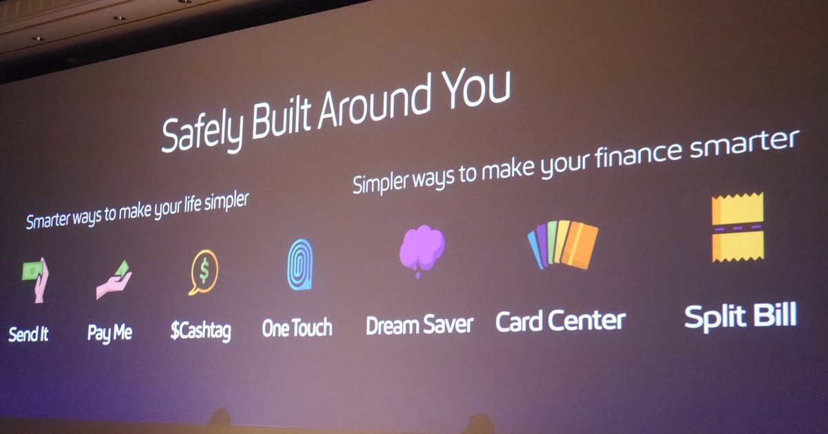
Jenius Sans main ability was communicating how the brand tells its story for their audience to represents the continuity, flexibility, and possibilities of the brand. And also to illustrate how the information weaves in and out. For example, by using Light and Regular weight for running copies and text on small sizes to work clearly and visible, while Bold weight for highlighting the headline emphasis and clearer information.
In the end, Jenius Sans indirectly works well in conveying specialized information to a specific audience for the Jenius platform, because the design-oriented and noticeable typography helps a brand communicate well and look different from a similar competitor and signifies a mature visual culture.