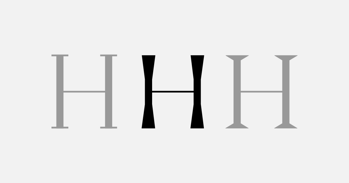
Celaraz is typeface with structural forms and pushes the stroke contrast. The idea evolved from the didone styles and wedge serif forms to feel explicit with the contrast remain visible and consistent on each character, and to avoid the dark spot several characters adjusted by adding the static traps to keep visible.
Celaraz adapted based on certain tones that retained the contrast of the classic typefaces, “how we can make a design that looks like sans-serif and feels like serif?”, that’s our first thing in our mind when designing this type family. The design took part back in 2016 when experimenting between the harmonic tones of Didones styles and nineteenth-century printing type like wedge serif styles, with the addition to pushes the serif to comprise the rigid forms and straightforward proportion.
While working on Celaraz’s first draft, we are faced with the challenge for making the typeface aligned harmoniously, the first experiment was to add a serif that resembles a brush to make softened forms with little detail at the end. The first version goes not as expected, the typeface does not look well at the large size with strange swell curve remain visible, to avoid that strange shapes, all the main base forms was changed with more extreme approach, by changing the contrast more high with thinner stroke and adding wedge serif look alike but a bit upward forming like a rod bones.

Celaraz concept development
The second result is a more visible of its contrast as well as more static with a serif that radiates upward, this form looks more solid in medium and large size, but remains functional on small sizes, other particular thing is the identical contrast on each weight makes this typeface more steady as well as the small details on each characters. The family available in four weights, including light, regular, bold, and extrabold, equipped with all matching italics on each weights.
To enrich the Celaraz’s four main weights, a standard Cyrillic character and Latin Pro encoding has been added to the family. Celaraz would fit especially for display and headline settings, but the small sizes of regular and light weight also works well as a text complement. Celaraz also includes a standard the single story of the a and g alternate character that can be found on stylistic set OpenType Features.